Grid
Grid
Grid
Grid

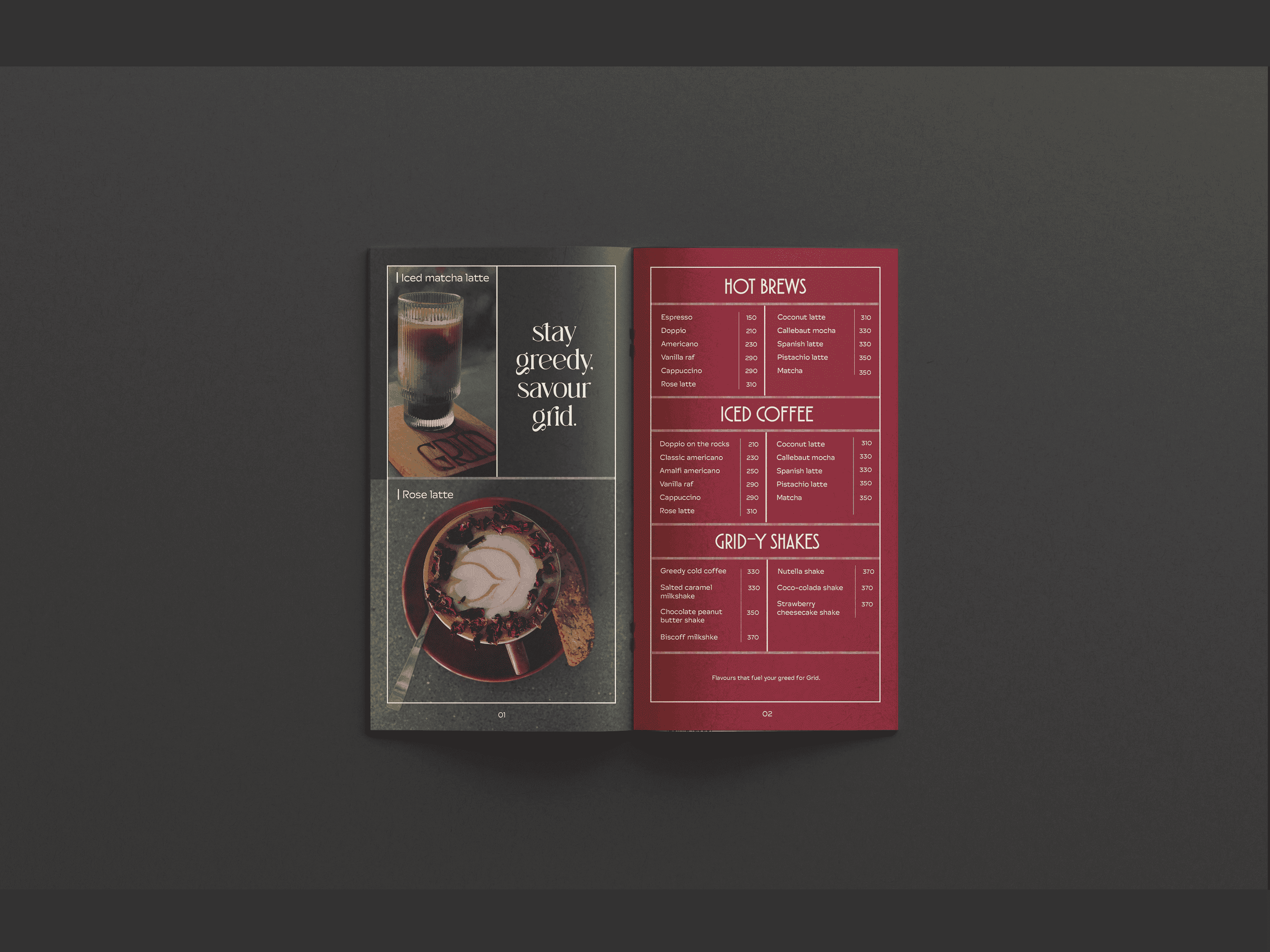
For Grid, I designed an identity that combines a clean grid system with minimal aesthetics. The goal was to create a visual presence that communicates not just the brand’s name, but the warmth, comfort, and quality of the food served at Grid.
For Grid, I designed an identity that combines a clean grid system with minimal aesthetics. The goal was to create a visual presence that communicates not just the brand’s name, but the warmth, comfort, and quality of the food served at Grid.
For Grid, I designed an identity that combines a clean grid system with minimal aesthetics. The goal was to create a visual presence that communicates not just the brand’s name, but the warmth, comfort, and quality of the food served at Grid.
For Grid, I designed an identity that combines a clean grid system with minimal aesthetics. The goal was to create a visual presence that communicates not just the brand’s name, but the warmth, comfort, and quality of the food served at Grid.
Client:
Client:
Client:
Client:
Haena Patel
Haena Patel
Haena Patel
Haena Patel
My Role:
My Role:
My Role:
My Role:
Lead Designer
Lead Designer
Lead Designer
Lead Designer
Year:
Year:
Year:
Year:
2024- 25
2024- 25
2024- 25
2024- 25
Service Provided:
Service Provided:
Service Provided:
Service Provided:
Logo, Branding, Packaging
Logo, Branding, Packaging
Logo, Branding, Packaging
Logo, Branding, Packaging


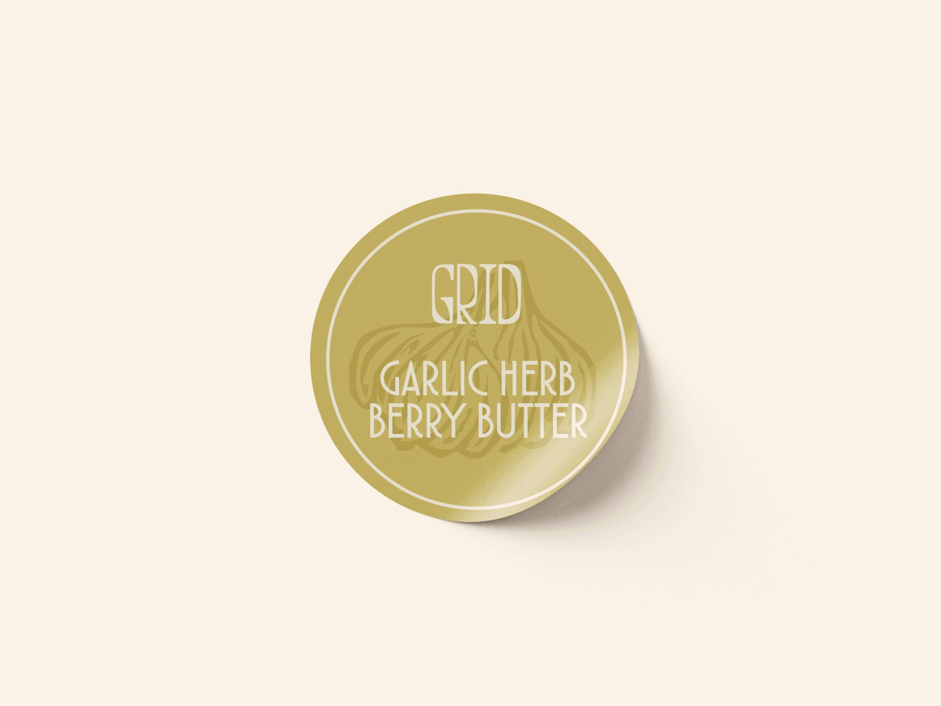

Personalized, Not Perfect
While many cafés today opt for sleek, type-based logos, Grid’s identity was built around making a lasting impression through personality. By maintaining the simplicity of a type logo, I focused on manipulating the typography to add a handmade, fresh feel—reflecting Grid’s focus on quality and comfort. This approach brought out the essence of the brand without sacrificing minimalism.
Making a Welcoming First Impression
Logos play a key role in shaping first impressions. The objective for Grid was to create a logo that feels inviting rather than intimidating. The result is a logo with softer edges, even with a traditional serif base, designed to make customers feel at home from the moment they see it.
